> ## Documentation Index
> Fetch the complete documentation index at: https://docs.kiwify.com.br/llms.txt
> Use this file to discover all available pages before exploring further.
# Default Theme
> Understanding the default theme and its parts
The Kiwify default theme has six types of sections that can be fully customized according to your preferences.
## Login
Displays the Kiwify login button with layout, title image and background image. Exposes the following parameters for the Theme Editor:
* `variant`: controls the layout -- sidebar or full background
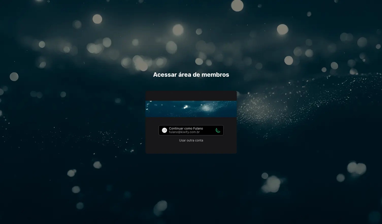
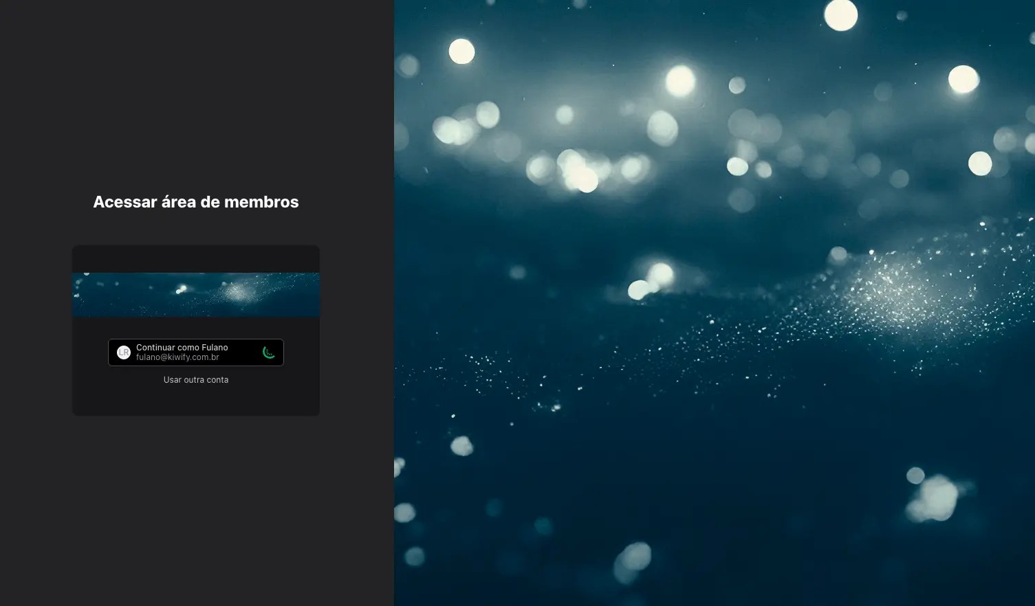 * `image_background`: image displayed in the login screen background (optional)
* `image_header`: image displayed above the login button (optional; uses the members area logo as fallback)
This section uses the `auth-button` snippet to display the login button, which is a simple wrapper for the login button natively implemented in the Kiwify Members Area.
## Banner
Image carousel with automatic slide transitions. Uses the [Embla Carousel](https://www.embla-carousel.com/) library for slide control. [Learn more about available libraries](/en/members-area/key-concepts/theme-architecture#available-libraries).
* `image_background`: image displayed in the login screen background (optional)
* `image_header`: image displayed above the login button (optional; uses the members area logo as fallback)
This section uses the `auth-button` snippet to display the login button, which is a simple wrapper for the login button natively implemented in the Kiwify Members Area.
## Banner
Image carousel with automatic slide transitions. Uses the [Embla Carousel](https://www.embla-carousel.com/) library for slide control. [Learn more about available libraries](/en/members-area/key-concepts/theme-architecture#available-libraries).
 When there is more than one slide, it displays arrows to advance and rewind slides, and direct slide access controls at the bottom.
Exposes a single parameter:
* `slides_delay`: how many seconds the component should wait before switching to the next slide, when there is more than one
Slides can be a maximum of 3, and are represented as [blocks](/en/members-area/key-concepts/theme/sections#section-blocks), which can have the following parameters:
* `mobile_image`: slide image in mobile version; if absent, desktop image is displayed on mobile as well
* `desktop_image`: slide image in desktop version; if absent, mobile image is displayed on desktop as well
If neither image is present, the section will appear broken to the end user.
## Courses
Carousel with links to members area courses. Each link is displayed as a card with the image and, optionally, the course name. Exposes the following parameters for the Theme Editor:
* `title`: title displayed at the top of the section
* `items_variant`: display mode for content titles; can have the following values:
* `content_over`: title always visible over the course image
* `content_hidden`: title is not displayed
* `mouse_hover`: title is displayed over the course image only when hovering over the card
* `items_layout`: card display format; can have the values `portrait` or `landscape`. See
* `all_accessible_courses`: boolean that controls which courses will be displayed in the section; if true, all courses the user has access to will be displayed in alphabetical order; if false, courses referenced in the section blocks will be displayed
This section can contain blocks, indicating which courses should be displayed in the section and in what order. Each block contains only one property: `course_id`.
If a course referenced in a block is not accessible to the end user, it will be displayed anyway. If the course has a members area sale configured, the end user will be able to click the link to make the purchase.
## Modules
Carousel with links to modules of a members area course. Each link is displayed as a card with the image and, optionally, the module name. Exposes the following parameters for the Theme Editor:
* `title`: title displayed at the top of the section
* `items_variant`: display mode for content titles; can have the following values:
* `content_over`: title always visible over the course image
* `content_hidden`: title is not displayed
* `mouse_hover`: title is displayed over the course image only when hovering over the card
* `items_layout`: card display format; can have the values `portrait` or `landscape`
* `course_id`: identifier of the course whose modules will be listed in this section
If a module of the course is not accessible to the end user, it will be displayed anyway. If the course has a members area sale configured, the end user will be able to click the link to purchase the complete course.
## Lessons
Carousel with links to lessons of a members area course. Each link is displayed as a card with the image and, optionally, the lesson name. Exposes the following parameters for the Theme Editor:
* `title`: title displayed at the top of the section
* `items_variant`: display mode for content titles; can have the following values:
* `content_over`: title always visible over the course image
* `content_hidden`: title is not displayed
* `mouse_hover`: title is displayed over the course image only when hovering over the card
* `items_layout`: card display format; can have the values `portrait` or `landscape`
* `module_id`: identifier of the module whose lessons will be listed in this section
If the selected module is not accessible to the end user, the entire section is not displayed.
## Continue Watching
Carousel with links to lessons recommended for the end user to continue watching (see [last\_watched\_lessons](/en/members-area/reference/objects/last_watched_lessons) object). Each link is displayed as a card with the image and, optionally, the lesson name. Exposes the following parameters for the Theme Editor:
* `items_layout`: card display format; can have the values `portrait` or `landscape`
If there are no lessons to continue watching, the entire section is not displayed.
## Cards
The courses, modules, lessons and "continue watching" sections are very similar: they display links to members area content in the form of cards. To avoid code duplication, these links are implemented in the `cards` and `cards-item` snippets.
The `cards` snippet is responsible for displaying the title, configuring the carousel and traversing the list of links, calling the `cards-item` snippet for each link.
It receives some arguments that make it quite flexible:
* `section_items`: list of objects that will be displayed; more details below
* `is_horizontal`: boolean indicating whether cards should take horizontal or vertical layout
When there is more than one slide, it displays arrows to advance and rewind slides, and direct slide access controls at the bottom.
Exposes a single parameter:
* `slides_delay`: how many seconds the component should wait before switching to the next slide, when there is more than one
Slides can be a maximum of 3, and are represented as [blocks](/en/members-area/key-concepts/theme/sections#section-blocks), which can have the following parameters:
* `mobile_image`: slide image in mobile version; if absent, desktop image is displayed on mobile as well
* `desktop_image`: slide image in desktop version; if absent, mobile image is displayed on desktop as well
If neither image is present, the section will appear broken to the end user.
## Courses
Carousel with links to members area courses. Each link is displayed as a card with the image and, optionally, the course name. Exposes the following parameters for the Theme Editor:
* `title`: title displayed at the top of the section
* `items_variant`: display mode for content titles; can have the following values:
* `content_over`: title always visible over the course image
* `content_hidden`: title is not displayed
* `mouse_hover`: title is displayed over the course image only when hovering over the card
* `items_layout`: card display format; can have the values `portrait` or `landscape`. See
* `all_accessible_courses`: boolean that controls which courses will be displayed in the section; if true, all courses the user has access to will be displayed in alphabetical order; if false, courses referenced in the section blocks will be displayed
This section can contain blocks, indicating which courses should be displayed in the section and in what order. Each block contains only one property: `course_id`.
If a course referenced in a block is not accessible to the end user, it will be displayed anyway. If the course has a members area sale configured, the end user will be able to click the link to make the purchase.
## Modules
Carousel with links to modules of a members area course. Each link is displayed as a card with the image and, optionally, the module name. Exposes the following parameters for the Theme Editor:
* `title`: title displayed at the top of the section
* `items_variant`: display mode for content titles; can have the following values:
* `content_over`: title always visible over the course image
* `content_hidden`: title is not displayed
* `mouse_hover`: title is displayed over the course image only when hovering over the card
* `items_layout`: card display format; can have the values `portrait` or `landscape`
* `course_id`: identifier of the course whose modules will be listed in this section
If a module of the course is not accessible to the end user, it will be displayed anyway. If the course has a members area sale configured, the end user will be able to click the link to purchase the complete course.
## Lessons
Carousel with links to lessons of a members area course. Each link is displayed as a card with the image and, optionally, the lesson name. Exposes the following parameters for the Theme Editor:
* `title`: title displayed at the top of the section
* `items_variant`: display mode for content titles; can have the following values:
* `content_over`: title always visible over the course image
* `content_hidden`: title is not displayed
* `mouse_hover`: title is displayed over the course image only when hovering over the card
* `items_layout`: card display format; can have the values `portrait` or `landscape`
* `module_id`: identifier of the module whose lessons will be listed in this section
If the selected module is not accessible to the end user, the entire section is not displayed.
## Continue Watching
Carousel with links to lessons recommended for the end user to continue watching (see [last\_watched\_lessons](/en/members-area/reference/objects/last_watched_lessons) object). Each link is displayed as a card with the image and, optionally, the lesson name. Exposes the following parameters for the Theme Editor:
* `items_layout`: card display format; can have the values `portrait` or `landscape`
If there are no lessons to continue watching, the entire section is not displayed.
## Cards
The courses, modules, lessons and "continue watching" sections are very similar: they display links to members area content in the form of cards. To avoid code duplication, these links are implemented in the `cards` and `cards-item` snippets.
The `cards` snippet is responsible for displaying the title, configuring the carousel and traversing the list of links, calling the `cards-item` snippet for each link.
It receives some arguments that make it quite flexible:
* `section_items`: list of objects that will be displayed; more details below
* `is_horizontal`: boolean indicating whether cards should take horizontal or vertical layout

 * `should_display_progress`: boolean indicating whether the progress bar should be displayed or not
* `percentage_field`: property within the `user_data` field of each `section_items` item that contains the value to be displayed in the progress bar
* `path_format`: string indicating the format of the URL to which the content points. Examples:
* `{id}`: the final URL will be the item ID
* `{course_id}/{id}`: the final URL will be the value of the item's `course_id` field, followed by a slash and the item ID
It also needs the following global objects to be passed to it:
* `section`
* `is_preview`
The `cards-item` snippet receives these same parameters except for `section_items`. Instead, it receives the `item` parameter, which is basically one of the items from the `section_items` list. This `item` parameter must be an object and can have the following properties:
* `thumbnail_slider_cover`, `logo_url` and `thumbnail`: URL for the card image. Any of the three names can be used
* `user_data`: object of type [user\_data](/en/members-area/reference/objects/user_data) or, if the item is a lesson, [lesson\_user\_data](/en/members-area/reference/objects/lesson_user_data)
* `custom_offer`: object of type [custom\_offer](/en/members-area/reference/objects/custom_offer)
* `course_id`: ID of the course to which the item belongs, in case of modules and lessons
* `module_id`: ID of the module to which the lesson belongs
* `id`: ID of the course, module or lesson
* `name`: name of the course, module or lesson to be displayed on the card
* `should_display_progress`: boolean indicating whether the progress bar should be displayed or not
* `percentage_field`: property within the `user_data` field of each `section_items` item that contains the value to be displayed in the progress bar
* `path_format`: string indicating the format of the URL to which the content points. Examples:
* `{id}`: the final URL will be the item ID
* `{course_id}/{id}`: the final URL will be the value of the item's `course_id` field, followed by a slash and the item ID
It also needs the following global objects to be passed to it:
* `section`
* `is_preview`
The `cards-item` snippet receives these same parameters except for `section_items`. Instead, it receives the `item` parameter, which is basically one of the items from the `section_items` list. This `item` parameter must be an object and can have the following properties:
* `thumbnail_slider_cover`, `logo_url` and `thumbnail`: URL for the card image. Any of the three names can be used
* `user_data`: object of type [user\_data](/en/members-area/reference/objects/user_data) or, if the item is a lesson, [lesson\_user\_data](/en/members-area/reference/objects/lesson_user_data)
* `custom_offer`: object of type [custom\_offer](/en/members-area/reference/objects/custom_offer)
* `course_id`: ID of the course to which the item belongs, in case of modules and lessons
* `module_id`: ID of the module to which the lesson belongs
* `id`: ID of the course, module or lesson
* `name`: name of the course, module or lesson to be displayed on the card