> ## Documentation Index
> Fetch the complete documentation index at: https://docs.kiwify.com.br/llms.txt
> Use this file to discover all available pages before exploring further.

# Overview

> Input types allow you to define different types of settings in your theme sections.

Input types are used to define how settings appear and behave in the theme editor. They allow you to create a user-friendly interface for customizing your theme sections.

## Usage

Input types are defined in the `settings` array of your section schema. Each setting must have a `type` property that specifies which input type to use.

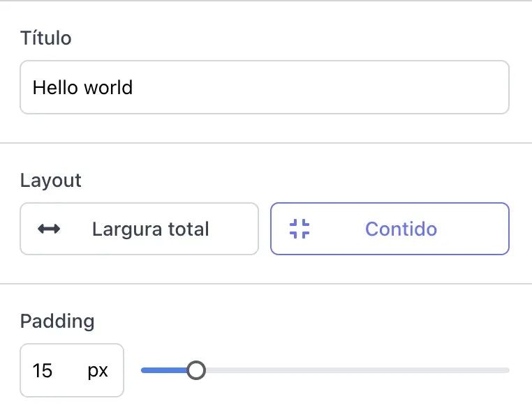
In the example below, we define a section with three different input types: a text input for the heading, a toggle group for the layout, and a range slider for padding.

<Columns cols={2}>
  <CodeGroup>
    ```json Schema theme={null}
    {
      "settings": [
        {
          "type": "text",
          "id": "heading",
          "label": "Heading",
          "default": "Hello, world!"
        },
        {
          "type": "select",
          "id": "layout",
          "label": "Layout",
          "options": [
            {
              "value": "full_width",
              "label": "Full width",
              "kiwi_extra": {
                "icon": "fa fa-arrows-alt-h"
              }
            },
            {
              "value": "contained",
              "label": "Contained",
              "kiwi_extra": {
                "icon": "fa fa-compress"
              }
            }
          ],
          "default": "full_width",
          "kiwi_extra": {
            "labeled": true
          }
        },
        {
          "type": "range",
          "id": "padding",
          "min": 0,
          "max": 100,
          "step": 5,
          "unit": "px",
          "label": "Padding",
          "default": 15
        }
      ]
    }
    ```
  </CodeGroup>

  <div class="code-group p-0.5 mt-5 mb-8 flex flex-col not-prose relative overflow-hidden rounded-2xl border border-gray-950/10 dark:border-white/10 bg-gray-50 dark:bg-white/5 dark:codeblock-dark text-gray-950 dark:text-gray-50 codeblock-light">
    <div class="flex items-center justify-between gap-2 relative px-2.5">
      <div role="tablist" aria-orientation="horizontal" class="flex-1 min-w-0 text-xs leading-6 rounded-tl-xl gap-1 flex overflow-x-auto overflow-y-hidden scrollbar-thin scrollbar-thumb-rounded scrollbar-thumb-black/15 hover:scrollbar-thumb-black/20 active:scrollbar-thumb-black/20 dark:scrollbar-thumb-white/20 dark:hover:scrollbar-thumb-white/25 dark:active:scrollbar-thumb-white/25" tabindex="0" style={{outline: "none"}}>
        <button type="button" role="tab" aria-selected="true" aria-controls="image-tab" data-state="inactive" id="image-tab-trigger" class="group flex items-center relative gap-1.5 py-1 pb-1.5 outline-none whitespace-nowrap font-medium text-primary dark:text-primary-light" tabindex="-1">
          <div class="flex items-center gap-1.5 px-1.5 rounded-lg z-10">
            Result

            <div class="absolute bottom-0 left-0 right-0 h-0.5 rounded-full bg-primary dark:bg-primary-light" />
          </div>
        </button>
      </div>

      <div class="flex items-center justify-end shrink-0 gap-1.5" />
    </div>

    <div class="flex flex-1 overflow-hidden">
      <div role="tabpanel" aria-labelledby="image-tab-trigger" id="image-tab" tabindex="0" class="w-full min-w-full max-w-full h-full max-h-full">
        <div class="w-0 min-w-full max-w-full py-3.5 px-4 h-full dark:bg-codeblock relative text-sm leading-6 children:!my-0 children:!shadow-none children:!bg-transparent transition-[height] duration-300 ease-in-out [&_*]:ring-0 [&_*]:outline-none [&_*]:focus:ring-0 [&_*]:focus:outline-none [&_pre>code]:pr-[3rem] [&_pre>code>span.line-highlight]:min-w-[calc(100%+3rem)] [&_pre>code>span.line-diff]:min-w-[calc(100%+3rem)] rounded-2xl bg-white overflow-auto overflow-x-auto scrollbar-thin scrollbar-thumb-rounded scrollbar-thumb-black/15 hover:scrollbar-thumb-black/20 active:scrollbar-thumb-black/20 dark:scrollbar-thumb-white/20 dark:hover:scrollbar-thumb-white/25 dark:active:scrollbar-thumb-white/25" style={{"font-variant-ligatures": "none", "height": "100%"}}>
          <div class="font-mono whitespace-pre flex-none text-sm h-full leading-6">
            <img src="https://mintcdn.com/kiwify-81/eqGeDYA02A7icNcw/images/members-area/schema-example.webp?fit=max&auto=format&n=eqGeDYA02A7icNcw&q=85&s=94b7139e16900a33ad021a7b108d1fa8" alt="Resulting fields in editor" width="762" height="598" data-path="images/members-area/schema-example.webp" />
          </div>
        </div>
      </div>
    </div>
  </div>
</Columns>

Check detailed documentation for each input type:

<CardGroup cols={3}>
  <Card title="Text Input" icon="text" href="/en/members-area/reference/schema/fields/settings/input-types/text">
    Basic text input fields
  </Card>

  <Card title="Range" icon="sliders" href="/en/members-area/reference/schema/fields/settings/input-types/range">
    Select a numeric value within a range
  </Card>

  <Card title="Select" icon="border-all" href="/en/members-area/reference/schema/fields/settings/input-types/select">
    Toggle button group for selecting an option
  </Card>

  <Card title="Checkbox" icon="square-check" href="/en/members-area/reference/schema/fields/settings/input-types/checkbox">
    For representing true/false values
  </Card>

  <Card title="Image Picker" icon="image" href="/en/members-area/reference/schema/fields/settings/input-types/image-picker">
    Image inputs
  </Card>

  <Card title="Course" icon="book" href="/en/members-area/reference/schema/fields/settings/input-types/course">
    Select a course from the members area
  </Card>

  <Card title="Module" icon="files" href="/en/members-area/reference/schema/fields/settings/input-types/module">
    Select a module from the members area
  </Card>
</CardGroup>

## Common Properties

All input types share these common properties:

<ParamField path="type" type="string" required>
  The type of input to use. See available types above.
</ParamField>

<ParamField path="id" type="string" required>
  Unique identifier for the setting. Must be unique within the section.
</ParamField>

<ParamField path="label" type="string" required>
  The label shown in the theme editor.
</ParamField>

<ParamField path="default" type="any">
  Default value for the setting. Type depends on the input type.
</ParamField>

<ParamField path="info" type="string">
  Additional information shown below the input.
</ParamField>

<ParamField path="kiwi_extra" type="object">
  Additional properties for the setting. Currently supported:

  * `hidden`: Boolean value, indicates whether this setting should be displayed in Theme Editor's configuration bar
  * `validations`: Apply validations to this setting before saving. Currently supported:
    * `required`: Boolean value. If true, this setting must be filled with a valid value.
</ParamField>
