Usage
Input types are defined in thesettings array of your section schema. Each setting must have a type property that specifies which input type to use.
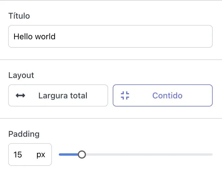
In the example below, we define a section with three different input types: a text input for the heading, a toggle group for the layout, and a range slider for padding.
Text Input
Basic text input fields
Range
Select a numeric value within a range
Select
Toggle button group for selecting an option
Checkbox
For representing true/false values
Image Picker
Image inputs
Course
Select a course from the members area
Module
Select a module from the members area
Common Properties
All input types share these common properties:The type of input to use. See available types above.
Unique identifier for the setting. Must be unique within the section.
The label shown in the theme editor.
Default value for the setting. Type depends on the input type.
Additional information shown below the input.
Additional properties for the setting. Currently supported:
hidden: Boolean value, indicates whether this setting should be displayed in Theme Editor’s configuration barvalidations: Apply validations to this setting before saving. Currently supported:required: Boolean value. If true, this setting must be filled with a valid value.